The Iowa Nutrient Research and Education Council (INREC) is an organization coordinated by the Agribusiness Association of Iowa. INREC is using farmer survey data collected by ag retailers to help Iowa State University quantify progress toward goals set by the Iowa Nutrient Research Strategy, the state’s main policy instrument for water quality improvement. Part of this effort includes data collection on the amount of nitrogen (N) fertilizer applied to Iowa corn fields. More about this a little bit later.
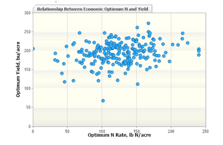
Corn loves nitrogen. About everybody knows that. However, the amount of grain produced relative to the amount of N applied varies because corn yields also relate to weather, pests, and other management decisions. As the saying goes, sh*t happens. For example, Fig. 1 is a graph I pulled from the Iowa State University agronomy website that plots corn yield (bushels/acre; y-axis) versus N application rate (lbs/acre; x-axis). Each dot is a corn field. If there was a strong relationship, the dots would align in a discernible pattern. If you can see a pattern in that plot and tell me what the optimum amount of nitrogen is based on that data, then you drank some strong tea today.
Luckily for farmers, there are smart people at Iowa State that can look at that data and tell us what amount of N farmers should use. To that end, they created a great tool that even someone of modest powers like me can navigate. It’s the Nitrogen Rate Calculator and can be found here: link. All you need to do is put in the going price of nitrogen fertilizer, the current or expected price for a bushel of corn, and the calculator grinds out a number.
From here on out, I’m going to walk you through several graphs and all I can do is ask that you hang with me and hope your eyes don’t gloss over. If you don’t have the time or patience to look at the graphs, you can save some time by skipping to the text that begins ***.
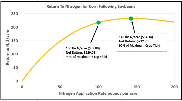
As I write this, the cheapest form of N is anhydrous ammonia, selling at $0.38/pound (link), while going the price for corn is about $4.25. When I put those numbers into the calculator and the select the option of corn grown in a field that had soybeans the previous year, I get the following graph (Fig. 2).

The calculator says that the optimum amount of N that should be applied (MRTN) is 143 pounds per acre. MRTN stands for Maximum Return To Nitrogen. It is not the rate that will necessarily produce the most corn grain, at least not in theory. Corn gradually responds less strongly to increasing amounts of N fertilizer. A point is eventually reached where these diminishing returns make further additions economically counterproductive. This is the MRTN. At the MRTN in the Fig. 2 above, a farmer can expect about 99% of the maximum obtainable return over the long haul.
The calculator also shows what happens when other amounts are applied. I did this in Fig. 3 below for 100 lbs of N. The return drops to 95% of maximum and $12.70 less per acre. This shows you have to increase the N fertilizer rate 43% to get that last 4% of economic return. This still makes sense for the farmer because the return on the investment justifies it.
In the next graph (Fig. 4) I add some water quality data (green line). This comes from a scientific paper (2), mentioned recently in this space, which uses data from test plots in southern Minnesota. It is the Flow Weighted Average nitrate-N concentration in the tiles draining these plots.

Quite the opposite to corn yields, there are no diminishing returns when it comes to “yield” of N from the tiles. The amount of N discharged to the stream network increases faster than the increase in N fertilizer amounts. At 100 lbs/acre of N fertilizer, the amount of nitrate-N in the tiles is 14.3 ppm. At the recommended rate of 143 lbs/ac (MRTN), it’s 17.8 ppm. At 200 lbs/acre, it’s 26.8 ppm. These absolute values for tile nitrate concentration may change within fields and may be slightly lower or higher for Iowa, but the important part of this is the curvature of the green line relative to that of the gold line. I want to emphasize that none of this is new research and scientists have known these fundamentals for a long time.
***Back to Iowa Nutrient Research and Education Council (INREC). I recently attended a meeting of the Water Resources Coordinating Council. At this meeting, an INREC representative reported that their survey data showed amounts of N applied to corn grown after soybeans averaged 169 pounds per acre, 26 pounds (18%) above the recommended rate (MRTN). Using the graph in Fig. 4, this excess would increase the tile nitrate concentration 24% to 21.3 ppm. My own analysis of federal datasets shows the overall rate of commercial N fertilizer to corn (both corn after corn and corn after soybeans) to be 189 pounds per acre, about 30 pounds more than the MRTN when both rotations are accounted for. And this is before we account for the N excreted by livestock, which is substantial (link, link, link).
So you might ask, why do we use an excess of N fertilizer, especially when we are fully cognizant of the environmental consequences? I think the MRTN graphs illustrate this. On that gold line there are two of what I call “risk zones”, shown below in Fig. 5. To the left of the MRTN, I have circled what I call the “economic risk zone”. The line drops fast, meaning the economic risk for too little N can be severe. The farmer shoulders the burden of this risk (mostly).
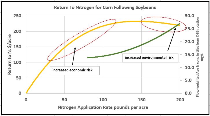
To the right of the MRTN is what I will call the “environmental risk zone”. Here the economic risk to the farmer of applying too much is actually quite small. Extra nitrogen is cheap insurance. Spend any amount of time doing what I do, and you will hear that fairly often. The ISU N rate calculator website says as much: “For producers with greater aversion to risk in their corn production system, then N application toward the HIGH end of the profitable N rate range will more frequently supply N that is at least adequate to meet corn N needs, but have on average greater N input cost and more frequently be above maximum economic response.” As the green line illustrates, however, the environmental risk (green line, poor water quality) increases rapidly as N rates move beyond the MRTN. The public shoulders the burden for this risk.
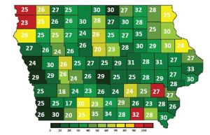
So I’m going to finish this on manure. The map below (Fig. 6) is from an Iowa State document. I added the white numbers. The color of the county indicates the available manure nitrogen relative to that removed in the crops. There are 10 counties where this is greater than 60%, i.e. there is enough manure to provide for 60% of the N fertilization needs. The white numbers are the commercial N rates from my analysis of the federal estimates of commercial fertilizer (1) sold per corn acre. Remember, the ISU recommended for rate for corn after soybeans is 143 pounds per acre. It’s pretty clear that availability of manure within a county does not affect sales of commercial N fertilizer very much. To emphasize, the white numbers are before we add in manure N.

And the situation is no better with phosphorus, the other major crop nutrient. Figure 7 below shows availability of manure P has almost no bearing on sales of commercial P fertilizer. Some counties have more than enough P, just from the manure, and farmers are still buying P fertilizer at the state average. One caveat here, some P is being applied to soybeans and I would remiss to not mention that.
Some people think I’m against manure as a fertilizer. I am not, if it is used to replace or supplement commercial fertilizer commensurate with crop needs. Right now, that is not the case, and this is a well-established driver of degraded water quality in Iowa. This is low hanging fruit when it comes to improving our water, and it would cost the taxpayer nothing to remedy this. Many people know this.
- Gronberg, J.M. and N.E. Spahr. 2012. County-level estimates of nitrogen and phosphorus from commercial fertilizer for the Conterminous United States, 1987–2006: U.S. Geological Survey Scientific Investigations Report 2012-5207, from https://pubs.usgs.gov/sir/2012/5207/.
- Vetsch, J.A., Randall, G.W. and Fernández, F.G., 2019. Nitrate Loss in Subsurface Drainage from a Corn–Soybean Rotation as Affected by Nitrogen Rate and Nitrapyrin. Journal of Environmental Quality.