I haven’t posted anything in two months, and part of the reason is that I have been consumed with aggregating the data that is presented here. There a lot of maps and graphs and charts in this one that I fear may rheumy-up your eyes, but I’ve tried to sprinkle some No-Doz pills here and there which you can pick up and hopefully stay awake.
Before I go any further, I want to say my main man, Dan Gilles from IIHR, makes beautiful maps and he helped me with these. I also should mention Tom Stoeffler and Jordan Barnett (and before him, Jason McCurdy) whose diligent work in the field and shop keeps water quality data flowing in to the University of Iowa.
The data presented here were generated from the IIHR real-time water quality sensor network that Tom and Jordan maintain, USGS water quality sensors, and the Iowa DNR ambient water monitoring program. All the data is for nitrate/nitrite reported “as nitrogen”, which is customary in the U.S. Nitrate is a regulated drinking water contaminant, helps drive the harmful algae and cyanobacteria blooms that plague Iowa’s lakes and streams and drives the Dead Zone in the Gulf of Mexico. It’s an environmental consequence of producing crops and food animals the way we do. I also used USGS stream discharge data for this essay.
The period analyzed here is the “water year” (WY) of 10/1/19 to 9/30/2020. I quantified various aspects of nitrate (as N) loss for 50 Iowa watersheds, and used data from 15 of them to calculate statewide nitrate loss. I also quantify these aspects for areas draining to the Missouri River, and areas draining to the Upper Mississippi River. The 15 watersheds, along with the “divide” between the Missouri and Mississippi, are shown in the first map below. Some notable subwatersheds within the larger 15 are noted in smaller font.
I’m missing data from a couple of watersheds I might otherwise have, and you can see these gaps in the above map: in Eastern Iowa, the Maquoketa River, and in Southern Iowa, the Thompson Fork of the Grand River. USGS removed their Maquoketa nitrate sensor a couple of years ago; we finally had to pull the IIHR equipment from the Thompson Fork last year because of repeated vandalism of the site. All in all though, we still have extensive areal capture (78%) of water leaving the state.
Data Sources
The water quality (nitrate) concentration data is an aggregation of the IIHR, USGS and Iowa DNR datasets. This water quality data is combined with USGS discharge (volume, streamflow) data to generate loads, e.g. the total mass of nitrate transported by a river over time (in this case, 10/1/19 to 9/30/20). Loads are divided by watershed area to get yields, e.g., load per unit area. This enables comparison of N loss or yield in an apples-to-apples way from watersheds of different sizes. Total discharge is divided by watershed area to get runoff, or water yield. This allows me to compare water discharge in an apples-to-apples way from watersheds of different sizes. Water yields are estimated for watersheds without a discharge gaging station by looking at nearby discharge gages.
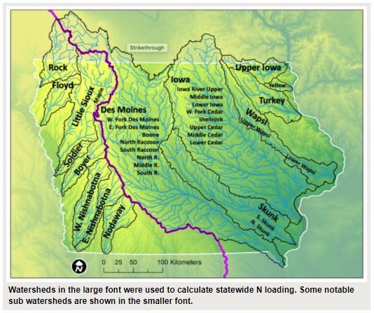
East vs West
The map and the table below illustrate Iowa’s division between the two major basins and how the stream nitrate data varies for each. The total mass (load) of nitrate-N leaving Iowa last year was 626 million pounds, with 435 million leaving on the Mississippi side and 191 million on the Missouri side. More is lost on a per acre basis from the Mississippi side, although the concentration of nitrate (mass per unit volume of water) is greater on the Missouri side. This is consistent with historical patterns, with the greater loss per acre in the east but higher concentration in the west. I will elaborate more on this later.
Individual Watersheds
The next map illustrates data from each of the 15 watersheds that figure into the statewide data. The black number is the N loss per total watershed area in pounds per acre. The red number is the N loss per crop area (corn + soybean) in pounds per acre. The blue number is the runoff in inches. Yes I know that not all nitrate comes from crop ground, but in Iowa it’s about 90-95% and probably higher in sparsely populated watersheds. A couple of things stand out on this map, the first being the extraordinary N loss in the three NE Iowa watersheds of the Upper Iowa, Yellow, and Turkey Rivers, with loss per crop acre exceeding 50 pounds in each and topping out at 78 pounds in the Yellow River watershed. We can see from the runoff numbers that this was the wettest part of Iowa; still 78 pounds is 78 pounds, and the Yellow River was one of the only watersheds in Iowa to have more N loss in ’20 than in ’19 (Yellow River runoff was less in ’20, 24.3″, vs 27.8″ in ’19).

Very large losses of nitrogen in NE Iowa have been apparent for a few years now. Why? Some thoughts: thin topsoil in this unglaciated part of Iowa (Driftless Area, Pleistocene Plateau) provides very little storage of water or nitrogen. Karstic bedrock near the surface provides an easy and rapid pathway to the stream network for water and everything it can dissolve, essentially acting like drain tile. Corn yields can be very good here, but the environmental cost of row crop in this area of Iowa is very, very high. Yes, when they try really hard and suck everything in, agriculture can squeeze the intense corn/soy/CAFO production model into this area of Iowa. Kind of like an old guy trying to get into a pair of skinny jeans. In theory, maybe it can be done, but……
The other thing that stands out in this second map is the Floyd River watershed in NW Iowa. One of Iowa’s driest in the past year (9.6″ of runoff), but still an N loss per crop acre of nearly 36 pounds. Compare the Floyd to the Wapsipinicon watershed of Eastern Iowa that had a similar N loss per crop acre (35.1 pounds) with nearly two times the amount of runoff as the Floyd. Lesson to be learned: Manure Matters. Watershed Floyd has about the same number of permitted CAFOs as it does square miles (~900), and it has been the only sensored watershed both of the last two years with an average flow-weighted nitrate concentration greater than 10 mg/L. Floyd is also the name of the pig trophy that Gophers and Hawks fight over each fall. Coincidence?
2020 vs. Previous Years
Statewide 2020 nitrate-N loads were lower than last year. There’s the good news. Of course we had a dry growing season in much of Iowa last year, and since nitrate is water soluble, it stands to reason more water = more nitrate in the streams. But it is interesting that statewide, the average flow weighted concentration of nitrate actually increased a little from last year. Think of it like this: you have a cup of sugar and a gallon of water. That gallon of water dissolves half of the cup of sugar. Now jump to the next year. We have another cup of sugar but only a half gallon of water. That half gallon of water dissolved not a quarter cup, but rather a third cup. This illustrates how nitrate pollution is driven by both supply and transport limitations. The supply is the amount of nitrogen vulnerable to loss every year; transport is the rain and river discharge. This supply of loss-vulnerable nitrate seems to be higher overall in areas draining to the Missouri than areas draining to the Upper Mississippi.
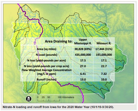
To account for year-to-year variations in precipitation, we often look at the 5-year Running Annual Average (RAA) load, i.e. the previous five years averaged as one. This is shown in the next graph. Although the RAA inched down in 2020, it’s still increased quite a lot over the past 20 years, and especially in areas draining to the Missouri River.
Another Way of Looking At It
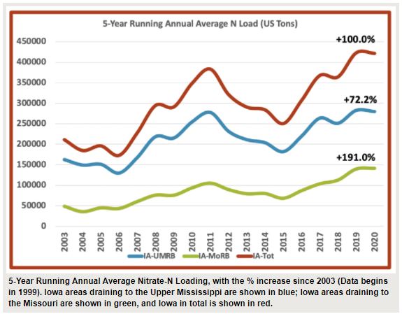
If you haven’t noticed, industry apologists like to rationalize the nitrate problem by handcuffing it to wet weather because, well, I guess they think it must look bad when you kill off part of an ocean and impair the drinking water supply of the state’s largest city for 50 years. But that’s just me speculating. Sort of. Anyway, I thought I would try to get creative with this idea. So I looked at all 50 of my monitored watersheds, determined what portion (%) of Iowa’s nitrate came from each one, what portion (%) of Iowa’s water came from each one, and divided the first number by the second number. So a value of 1.0 would be equivalent to the state as a whole; above 1 = worse than average; below one = better than average. This data is shown in the table below.
You can see Boss Hogg is the Floyd River Watershed. No surprise there. Sharing the same sty as Floyd is the very swiny South Fork of the Iowa River watershed. Going down the list, every one of the top 10, except #3, is either home to a lot of swine, or very near one. Also, if you need evidence that we aren’t going to “project” (i.e. watershed project) our way to clean water, look no further than South Fork. They’ve had an ongoing project since the Clinton Administration (1999), and it’s still one of Iowa’s worst for nitrate pollution. By the same token, South Fork is also evidence we aren’t going to “science” our way to clean water–it’s the topic of countless published scientific papers, including at least 10 in the last year alone. Now that’s some exciting momentum!